The palette, the technique and why I framed The Reflection Collection
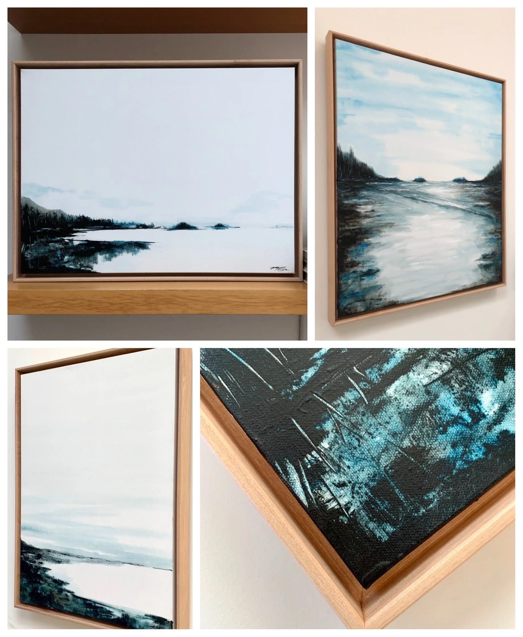
The palette I chose for this collection is a perfect reflection of our rainforest climate here on the west coast of Canada—muted, almost monochromatic. I strictly used three colours: black, burnt umber and pthalo blue, allowing the water on the canvas to spontaneously and unpredictably mix the colour for me. I drench the canvas in water and randomizing add dabs of these three paint colours, then very quickly spread and shape the paint with a spatula and palette knife. I use Golden acrylic paint for this as they are the only company that has thoroughly tested high water dilution and guaranteed their paint for adhesion and archival duration.
Seven of the paintings are framed in gorgeous locally hand-milled maple frames by Brian Mycroft @mycroft_woodworks in Sannich, BC, Canada. I really felt these paintings deserved the extra special treatment that framing gives. As well, due to the large unused white area of the surface, the subject needed to be contained or boarded, like driftwood on the shoreline. I wanted a local, renewable wood and I wanted to stay local, so Brian was the perfect choice. These skillfully framed six paintings are “ready to install” in your home. The smallest being 16”x 20” and the largest at 36” x 48”. Whether it’s art for a cozy corner, where you can cuddle up in a chair with a cup of tea or a large statement piece for over the fireplace that’s meant to impress—this collection has everything.